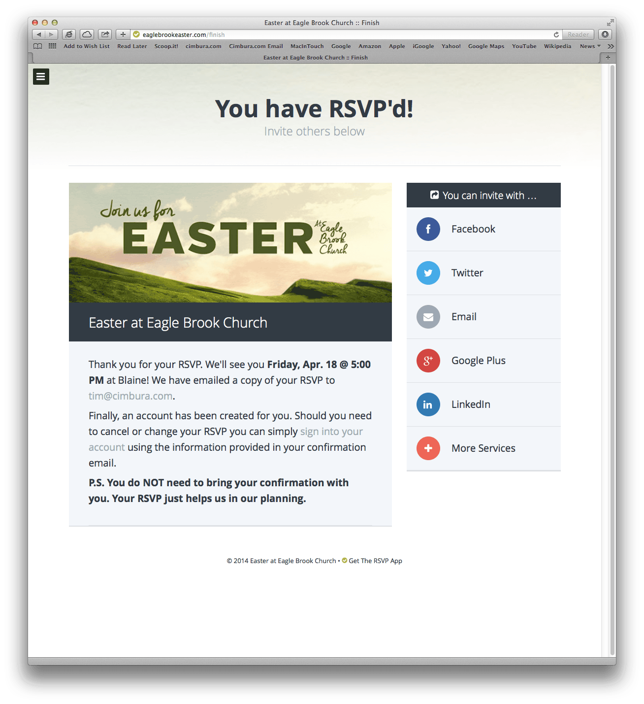
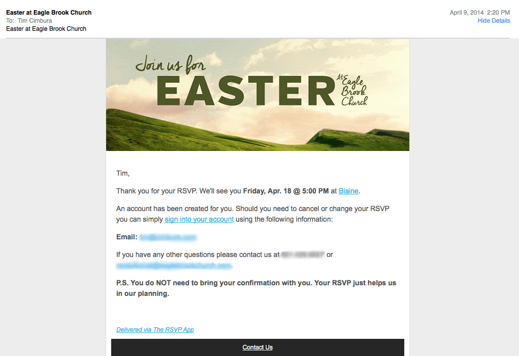
We recently came across a web application that takes RSVPs to reserve spots at the Easter service for a large church in our area. The application is a great example of clear process and clean spot-on user interface design. The application is fully responsive so that it works just as well on mobile devices. We present these screen shots here as inspiration for application developers to build applications in a similar fashion.
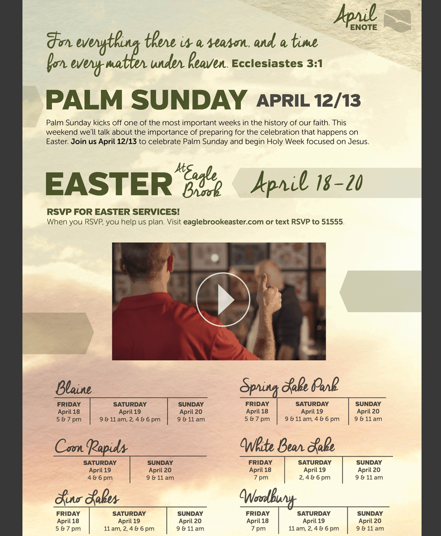
From the user perspective, it starts with a well designed email announcement.
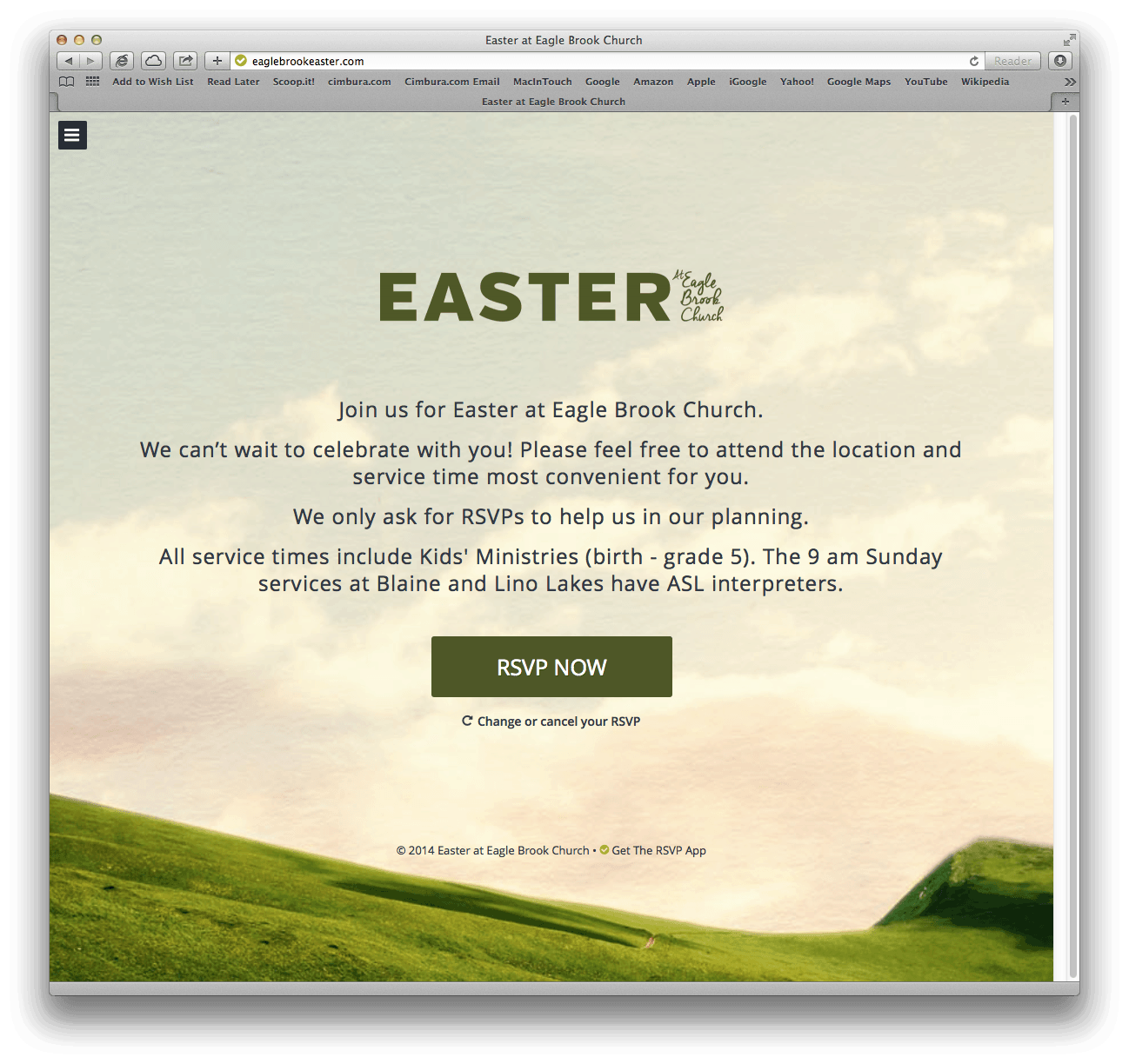
Clicking on the button to RSVP in the email brings us to the following screen with simple instructions about what you are about to do and one button to start the process…
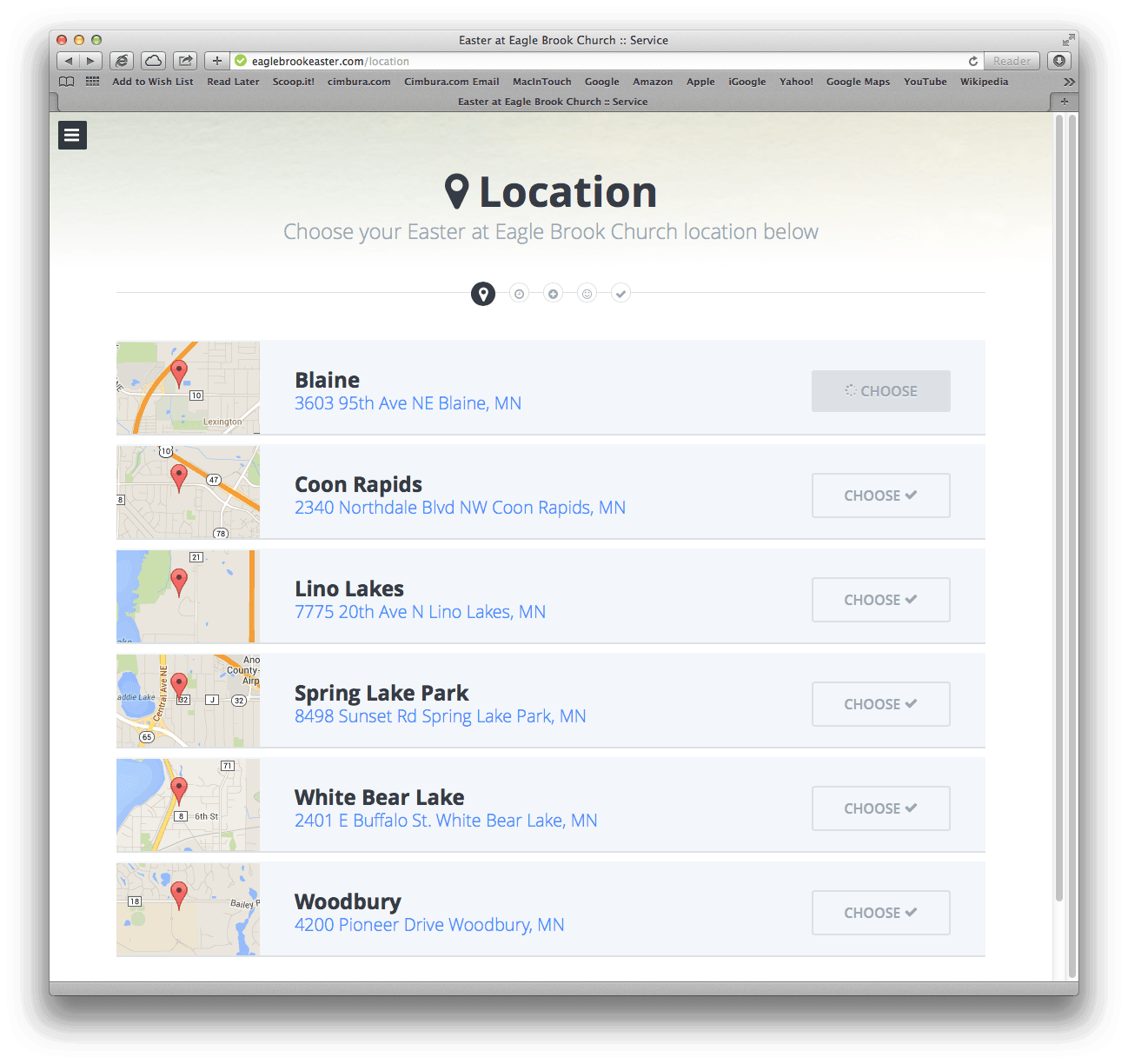
The user now selects the location from a list of choices with clear maps available for each option. Notice the progress indicator showing the matching icon and which step you are in.
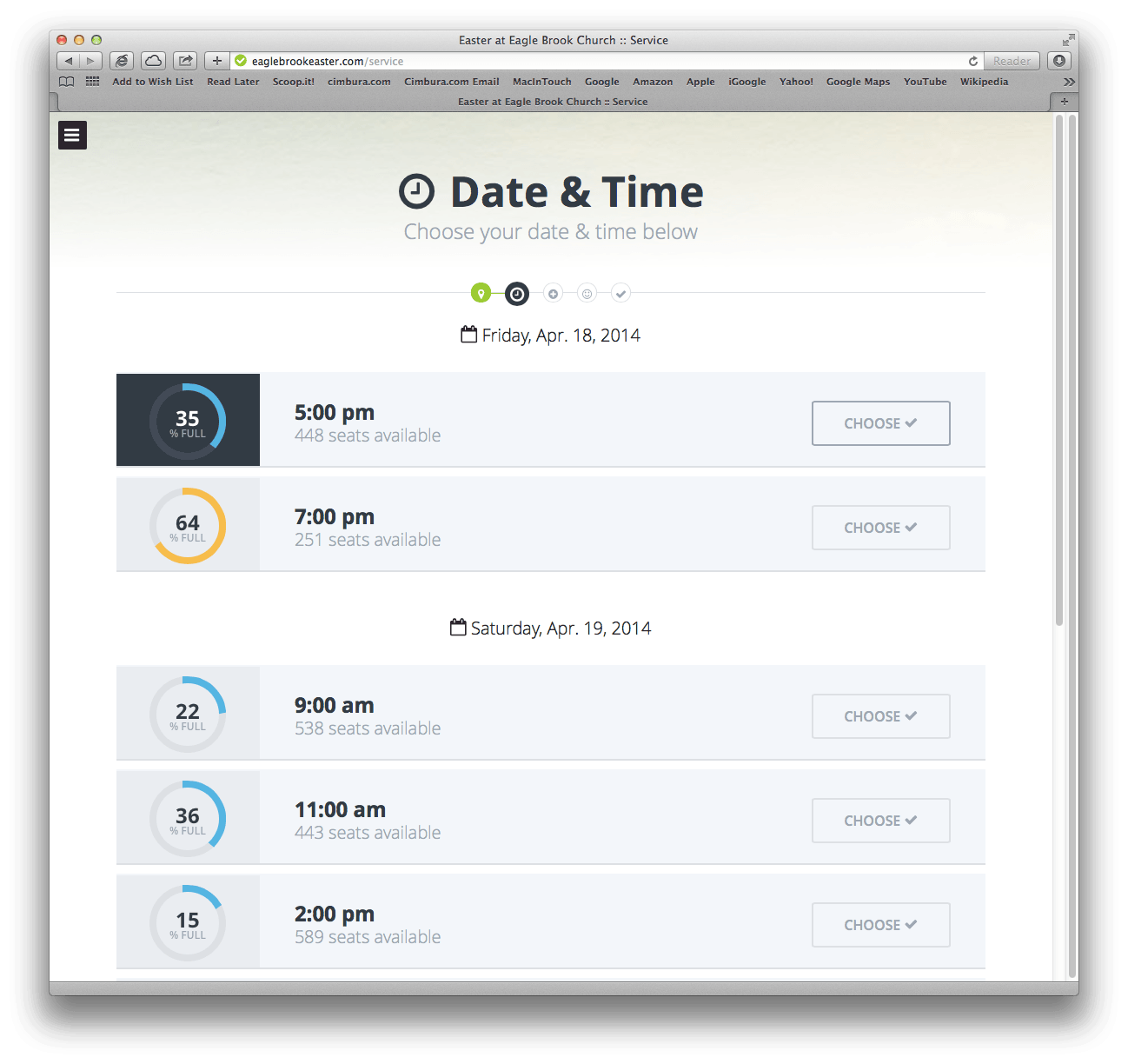
 Next, the date and time is selected with clear graphic indications regarding what times are available.
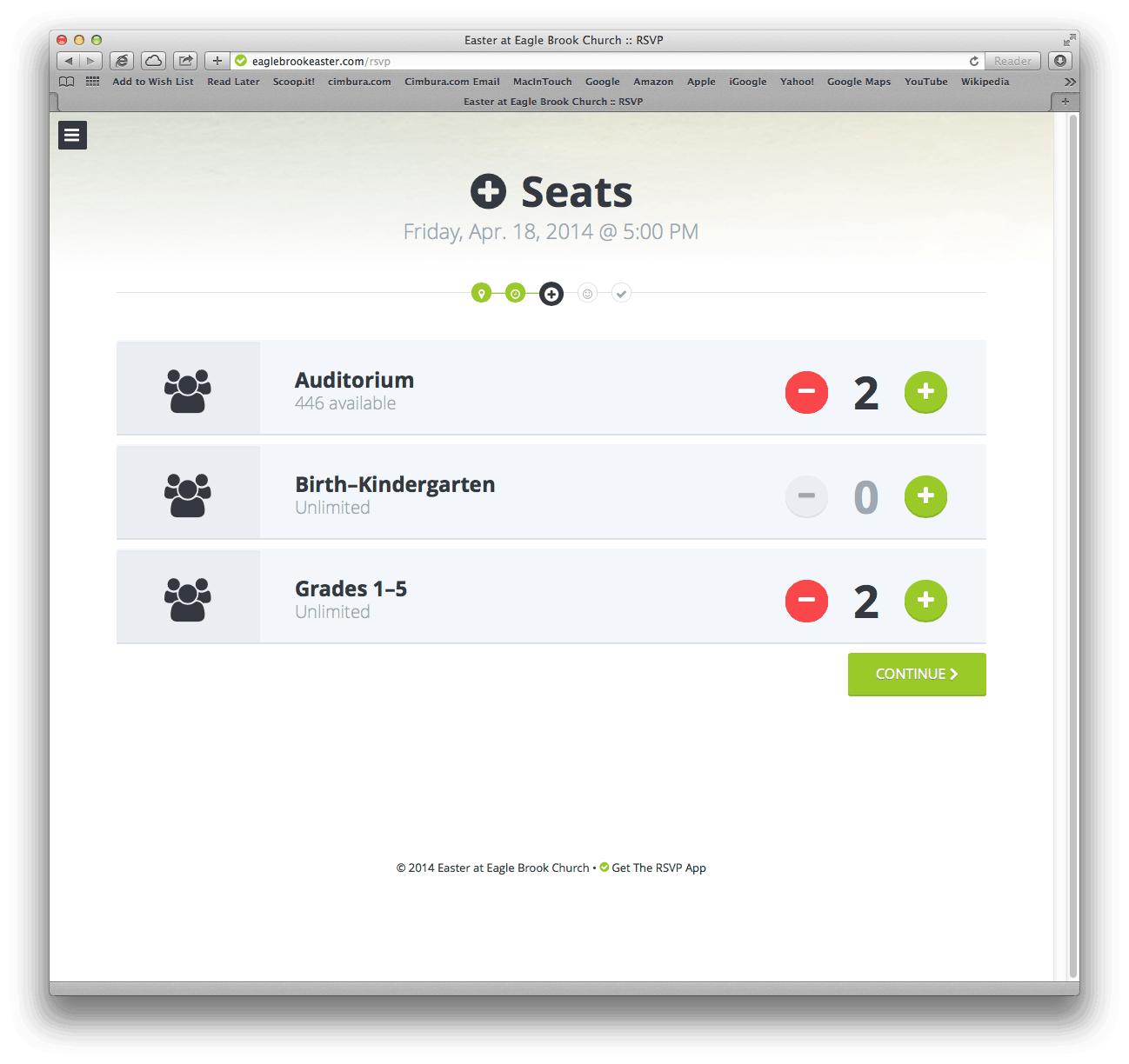
 Next, the number of seats for each area within the building is presented. The (-) and (+) buttons make it easy to modify your choices.
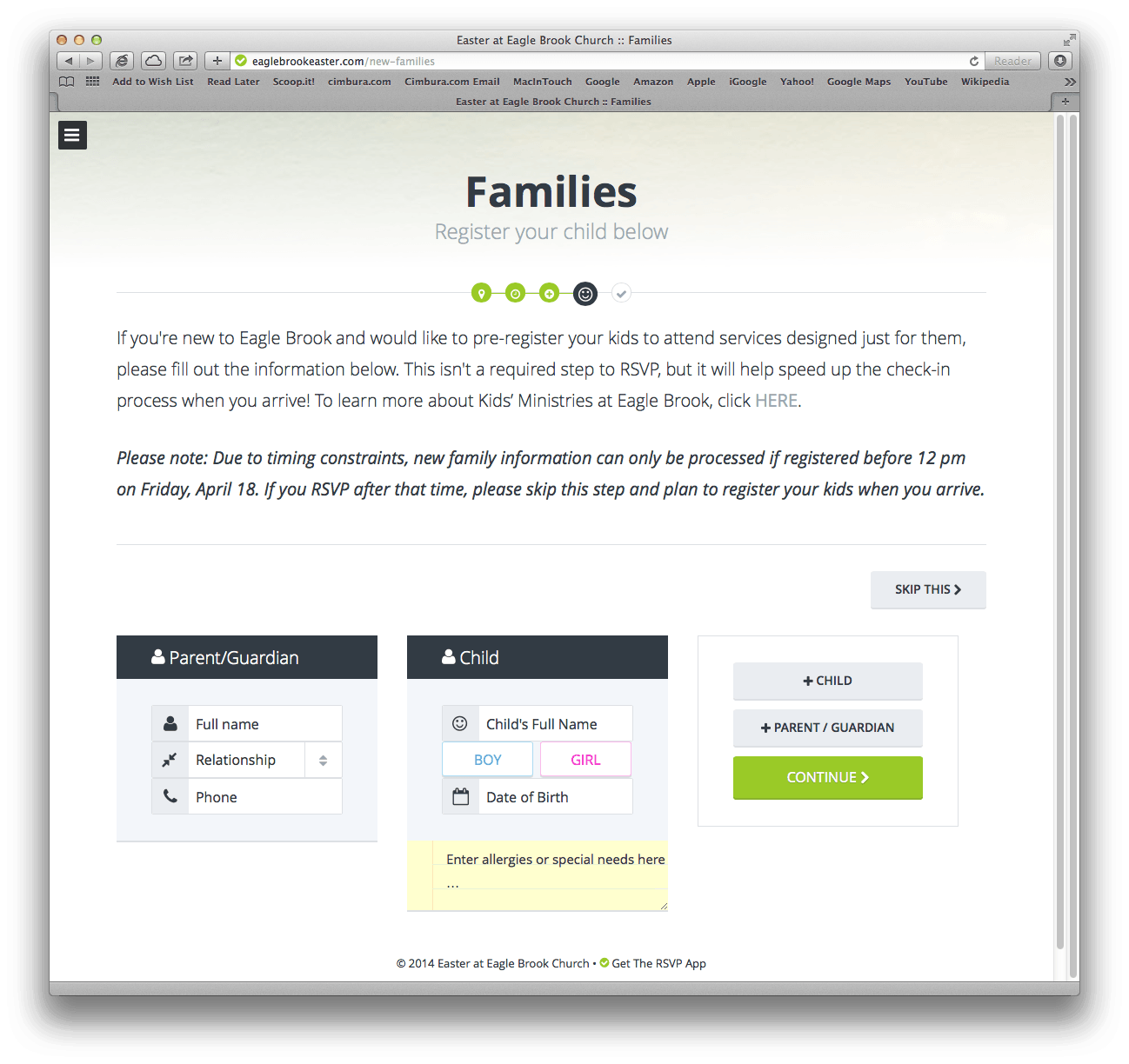
Taking care of families is also straightforward. Even though this is one of the more complex option screens, the buttons and selectors make the choices clear.
After completing all steps, you are prompted to share the experience easily with other friends via the main social networking sites…
Then you receive a confirmation email to let you know all is well…
According to the web site for the company that created this workflow, “The RSVP App helps you deliver remarkable event experiences by promoting, sharing, managing and simplifying big event registrations.” They’ve done an awesome job that nearly any application designer can learn from.


