
FileMaker 17 was released this week, and LuminFire has a series of blog posts highlighting our favorite features. Be sure to check out the other posts and keep an eye on our blog page for the latest news.
A big focus area in FileMaker Pro Advanced 17 is the interface in layout mode. I hesitate to say “new layout tools” because there aren’t any new object types or new tool buttons in the toolbar. But the way you work with the layout tools have been improved. A lot of the changes may seem subtle, but once you get used to working in FileMaker 17, it is going to be hard to go back. If you’ve tried to edit a script in FileMaker 13 or older recently, you’ll know what I mean!
In-line Fields, Objects, and Inspector Panes
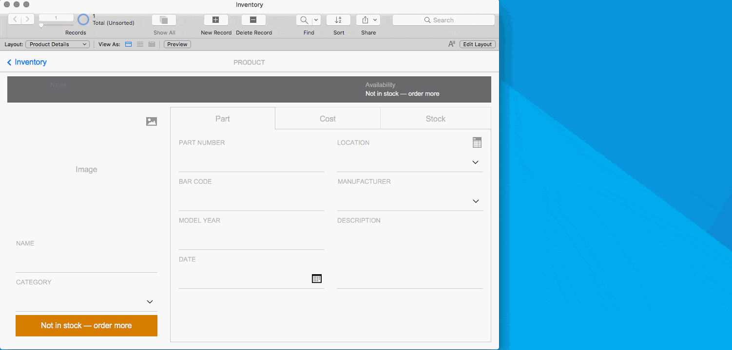
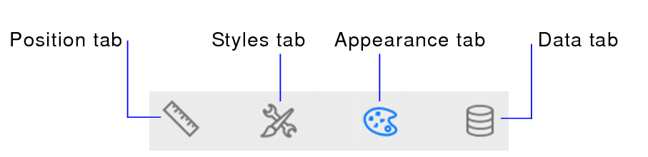
The biggest change to layout mode are the new in-line panes for the Fields Tab (formerly the Field Picker), Objects Tab (formerly the Layout Objects window), and the Inspector. These were all separate floating palettes before, and with varying interface standards. They now can all live in the same window and have a unified appearance. The Fields and Objects tabs are on the left side and the Inspector is on the right. When you change from Browse Mode to Layout Mode, your selected panes will automatically slide out, shifting your window over, if necessary.
The new panes keep your screen free of clutter and reduce the need to shuffle windows and palettes around, especially when working on a smaller screen like a laptop monitor. If you have the screen real estate and you are used to having multiple Inspector palettes open, fear not… you can still open multiple Inspector palettes. Simply go to the View menu > Inspectors > New Inspector. You can open as many Inspectors as you want, though why you would need more than one for each of the four inspector tabs is beyond me. I usually find that one is enough, and the keyboard shortcuts command/control 1, 2, 3, or 4 allow for quick switching between Inspector tabs.
Back on the left side of the window, the Objects Tab remains mostly unchanged from FileMaker 16’s Layout Objects window. You can still search for items on your layout by object name, filter by object type, hide and show items in Layout Mode, and drag items up and down to change their z-order on the layout.
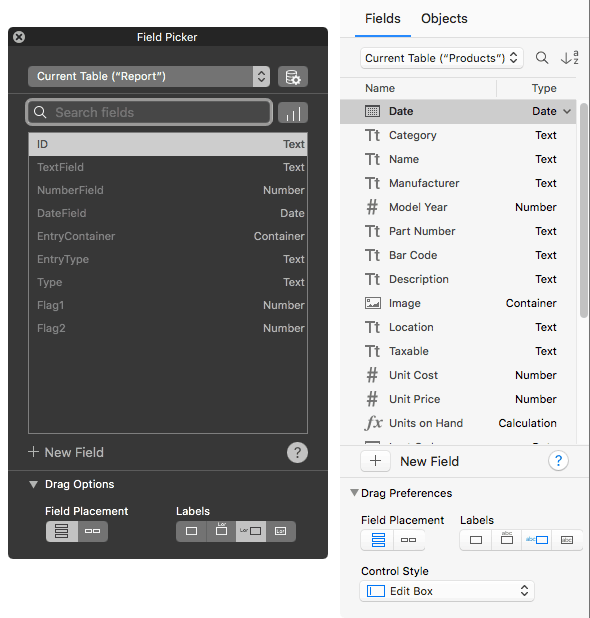
The Fields tab got some much needed love, compared to the previous Field Picker. The old Field Picker had a “dark” look that almost universally despised for being different than every other palette. Certain OS settings or desktop backgrounds could render text nearly unreadable. DevCon candid conversations revealed a dislike, even among FileMaker engineers. The new Fields Tab is clean looking and fits in with the rest of the Layout Mode user interface. There is even a new option to set the Control Style of fields that you drag onto your layout.
Selecting objects within a group
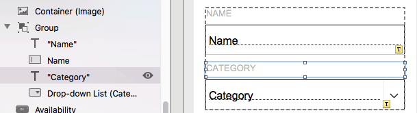
With the Objects tab, you quickly see the items in a group by expanding the disclosure triangle and even select an individual item within a group, but now there is an easier way. In FileMaker 17, simply click on a group to select it, then click a second time to select an item within the group. You now get a dashed line showing you the bounds of the group, with the usual highlight line around the selected object.
If you have stacked, grouped objects, there is still no way to “drill down” through the stack to select items underneath the top item, like you can in Adobe Illustrator. But you can still use the Objects Tab to temporarily hide foreground objects and then select the lower objects.
Enhancement to the Button Setup window
A nice improvement to the Button (or Button Bar) Setup window is the addition of a field to show the Optional Script Parameter. Huzzah! This is extremely convenient because you no longer need to click into the Specify Script dialog to see or edit the script parameter. Now it’s right there, and a click brings up the Specify Calculation dialog, ready for editing.
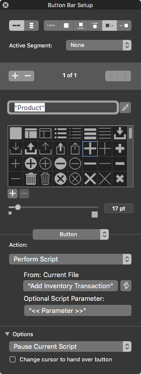
Pro tip: I find myself using regular buttons less and less. A single-segment button bar does the same thing, plus has the advantage of being able to specify the button label with a calculation. You can also easily change from a button to a popover button segment, or add additional segments if your needs grow.
Other observations
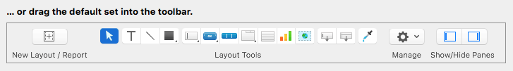
Some other, minor things that we have noticed include a change to the default set on the toolbar in Layout Mode. The layout navigator buttons and slider are no longer included in the default set, but you can add them back in if you like.

Jon has a nice writeup on the new Master-Detail portals.
There are probably some other hidden gems in Layout Mode. We can’t wait to discover them! If you are ready to upgrade to FileMaker 17 or have questions about licensing, contact us today!