
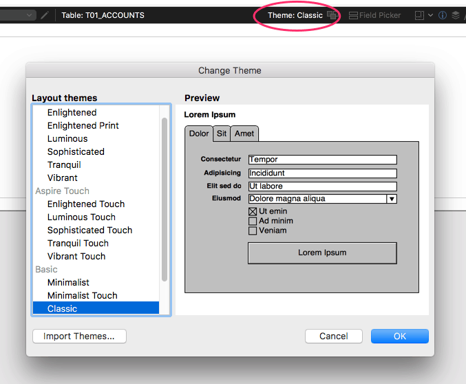 When you drop into Layout Mode, what do you see? If you haven’t done much design work on your FileMaker database in the last four years, you may still be rocking the Classic theme. That’s a bad thing, because object styles are all defined locally. That means a lot of unnecessary data being loaded for each layout, and a lot of busy work achieving a unifying look.
Since FileMaker 13, Themes and Styles are available that make building a well designed, professional looking application with FileMaker easier and more efficient. Styles are pre-defined formats that can be applied to layout objects like fields, buttons, etc. Themes are collections of coordinated styles for a specific purpose like printing, mobile devices, or desktop display. FileMaker provides some guidance for using themes and styles in their help article. Themes and styles make it easier to globally change the look of an app across the solution similar to how themes work in PowerPoint or Keynote.
As a best practice at LuminFire, we use 3 custom themes based on the Enlightened FileMaker themes called BrilliantThemes. They are available in the free BrilliantHub Starter solution (formerly called fmIgnite).
We use three distinct themes, based on the type of layout:
- BrilliantTheme – Desktop/laptop work
- BrilliantTheme Touch – Mobile devices like the iPhone and iPad using FileMaker Go
- BrilliantTheme Print – Printing reports
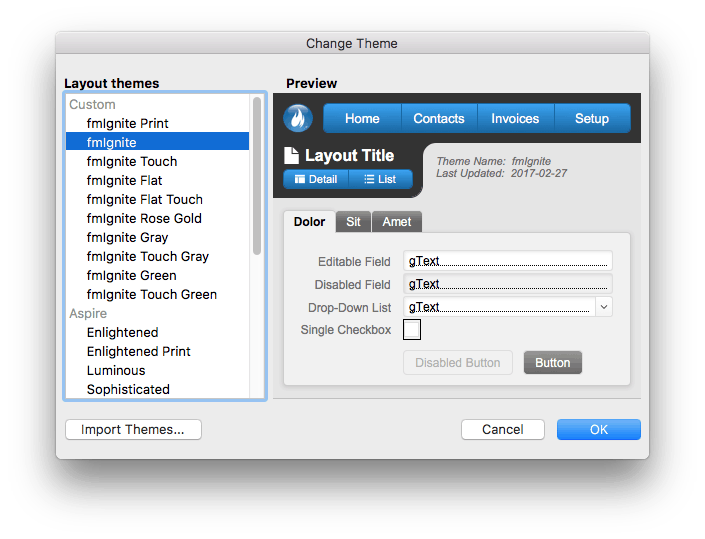
Those other custom themes you may have noticed in the list are… experiments. Don’t ask about our “Rose Gold” effort. ;) The image saved in the Preview part is generated from the top/left 368×306 pt section of whatever layout you last saved the theme on.
We maintain a layout devoted to listing and displaying all theme styles. Here’s a quick video showing all of the styles: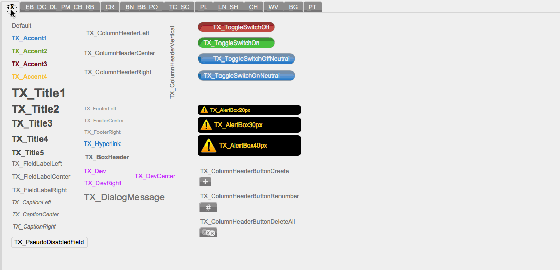
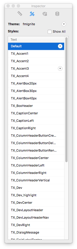
Selecting a text object on a layout and showing the Styles inspector (shown on the right) will reveal a host of Text styles to choose from. Each one is prefixed with “TX_” (short for “text”). Below is a complete list of all prefixes we use in the BrilliantHub theme:
- TX – text
- EB – edit box
- DC – drop-down calendar
- DL – drop-down list
- PM – pop-up menu
- CB – checkbox set
- RB – radio button set
- CR – container
- BN – button
- BB – button bar
- PO – popover button
- TC – tab control panel
- SC – slide control panel
- PL – portal
- LN – line
- SH – shape (rectangle, rounded rectangle or oval)
- CH – chart
- WV – web viewer
- BG – background
- PT – layout part
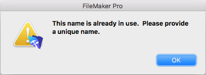
A proper naming convention is helpful just to keep things straight. The prefixes are critical because if you try to name a Text style as “test”, and then try to name a Edit Box style as “test”, you’ll run into this error message:
Upgrading from Classic to a modern theme, especially in a large system, is no small undertaking. Whether you choose to use one of FileMaker’s built-in themes, build your own, or try out ours, you’re going to need to apply it to every layout in your system and fix issues that occur. Updating navigation and other UI elements at the same time to advantage of new features like button bars, vector icons, and popovers is also wise. This all takes time but resulting combination of a modern look and feel, increased performance, and ease of future development/maintenance has a much quicker return on investment than most people realize. Can’t find the time? Need help? We’d love to help you upgrade the theme in your system, just contact us for a free consultation.

Tim Cimbura – CEO, CFO and Solution Engineer
Tim is an expert in creating custom business solutions that make businesses more effective, productive, and profitable. He specializes in rapid application development with Claris FileMaker, Laravel, and WordPress. He also knows Apple macOS technology inside and out.