Large relationship graphs in FileMaker can get difficult to navigate. You spend a lot of time scrolling around or zooming in and out to try and find the relevant area where you need to work. There are a couple of ways to deal with this problem.
One way is to use the 2empowerFM FileMaker Developer Assistant. With it you can search for any text on the graph and go directly to it. We consider this to be an essential FileMaker developer utility.
But what if you don’t have this tool and would like a quick way to index and find base table occurrences on a large relationship graph? Here’s a technique we saw demonstrated recently at our local FMPUG-MN group.
The basic idea is that you create a short key index out of the annotation notes you can add to the relationship graph. This index will remind you what keys to hit to go to different areas of the relationship graph. Then you add annotation notes to different areas that also begin with the same numbers as your key.
You get an annotation note by click on the “A” icon in the relationship graph, dragging a note out onto the graph, and then typing some text.
Since the relationship graph will auto jump to different areas based on the keys you type, typing numbers and naming notes that also begin with those numbers will allow you to jump to different areas of the graph quickly.
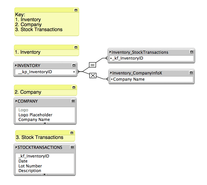
Here’s an example. Although this works, the graph is pretty small so it’s not really that helpful…but it’s just a demo of the technique so you can see how to implement it.

Typing “3” for example, would go directly to the Stock Transactions area. The Key at the top would show when you open the graph and remind you what number to type. It’s the index for the entire graph.
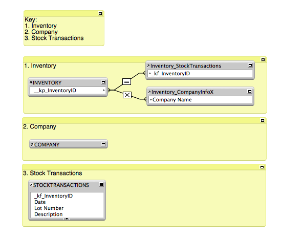
Another style of the same technique would be to place the annotations behind the graph as shown in this example:

Update 9-17-15: Robert Schaub took the idea in this post to the next level in the following video:
By placing the notes behind the relationship icon and providing a key, it’s possible to use the keyboard/keypad to type the associated number and have the target relationship icon appear to be selected and highlighted. The relationship graph is cleaner looking and your destination easier to find.
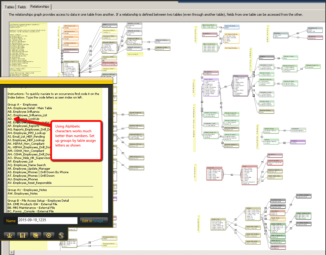
You can use an alphabetic code instead of numbers as well to get more options. See the graph example below:


