
Tell Your Story with GIS
Cartography is the art and skill of making maps. It involves elements of design, story telling, statistics, math and countless other skills. This blog post won’t make you a cartographer, but it will expose several common cartographic issues that come up when designing web maps.
Maps tell stories, and what makes your story unique is the data you display and how you display it. Putting your data on a map is a mix of technical options and creative inspiration.
Technical Considerations
When we discuss map parts we often refer to layers. You generally start with a basemap layer, then on top of that you might show a state boundary layer, and finally on top you could display points of interest.
The types of layers that you’re working with determine what creative options are available to you.
Raster vs. Vector Map Layers
There are two main types of layers, raster image layers and vector layers. Raster layers are made up of grids of pixels (just like digital images) while vector layers use math to efficiently store point, line and polygon shapes. Entire blog posts can be dedicated to the subject, so if you’d like to know more about the differences, check out this blog post over at GIS Geography.
For creative purposes, what you need to know is that to style raster data you will need a GIS Server such as GeoServer, ArcGIS Server or MapServer.
Vector data can be styled right in the browser using rules very similar to the CSS rules you or your web developer are already familiar with.
Many of the principles that follow apply to both raster and vector data, but since most users have vector data some of the details are vector specific.
Choosing Colors
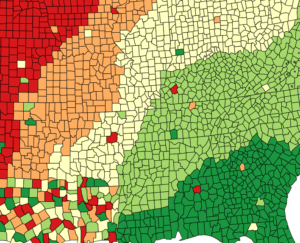
Color is one of the most powerful attributes in map design. Users will arrive at your site with ideas of what certain colors mean.
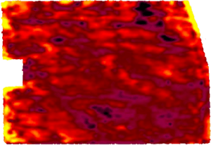
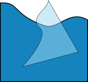
For example, if the map in Figure 1 shows how much rain has fallen, can you pick out which areas have had too little rain and which areas have the right amount? You probably assumed that red means bad and green means good, because that’s what we’re accustomed to. You may also have assumed that the darker green got more rain than the lighter green.
Besides considering the meanings of colors, and if they coordinate with your site’s theme you should also consider the fact that 4.5% of the population has some form of colorblindness. Designing a map that is unusable by such a large percentage of users doesn’t make much sense.
Choosing a color scheme for your data should take users preconceived notions into account along with other factors like if the different categories represent a progression or just differences, and if the colors fit in on your site.
A great place to start when deciding on colors is the Color Brewer 2 tool by cartographer Cynthia Brewer. It has a good collection of color palettes for different types of data along with information about which palettes are print friendly, colorblind friendly and copy-machine friendly.
Choosing Map Symbolization
Besides color, the symbols you choose to represent your data will make the biggest difference in how users receive your map. Depending on your data you’ll need to symbolize points, lines and polygons.
Point Symbolization
Points are the most common type of data to find on web maps. With any of these three options for symbols be sure to remember that larger symbols imply that something is more important!
Pins / Markers
Most people are familiar with the inverted tear-drop ![]() map pin that Google Maps, Leaflet and other maps use to display points by default. The default marker is a safe choice, but there are excellent sets of cartographic icons such Maki Icons which present more information to the user than a tear-drop – using airplane to represent an airport or a spoon/fork for a restaurant can convey much more than a generic pin.
map pin that Google Maps, Leaflet and other maps use to display points by default. The default marker is a safe choice, but there are excellent sets of cartographic icons such Maki Icons which present more information to the user than a tear-drop – using airplane to represent an airport or a spoon/fork for a restaurant can convey much more than a generic pin.
Custom Markers
If you want something personalized, nearly any image can be used as a marker. Ensure that the images you choose work well at small sizes. Simple images tend to work best. Be careful not to use too many custom markers — they can be visually stimulating, and using too many may be distracting.
Circles
Circles can be more compact than markers or custom icons and are the most flexible if you want to change the symbolization based on attributes of the point the circle represents. For example, you can set the circle to be larger or smaller based on the population of a city, or you could use the color or opacity of a circle to have different meanings.
Line Symbolization

Line features, such as roads and routes, are more difficult to style than points or polygons because there are so many options. The main things to consider when deciding how to style lines are color, line thickness, opacity and if it should be solid, dashed or dotted.
Line features often provide context to point features and can use less prominent styles so they don’t steal attention from the points. For example, points might be the start and end point of a trip, and the line is the path to take. The most important thing for the user to focus on is the start and end point, the path in secondary.
Polygon Symbolization
Polygons have two parts which can be styled independently. The inside of the shape (aka fill) and the border (aka stroke). The border has the same options as lines — color, thickness, etc — but the inside has only color, and opacity.
Opacity is actually very important for Polygons. Very often the basemap provides context for what the polygon represents. If the polygon is completely opaque, the user won’t be able to see the basemap at all. It may be useful to think of the polygons as a highlighter, used to draw attention to important parts of the basemap — use it to make information stand out, not to cover it up.
Map Interactions
Making a pretty map is only the first step. Once you’ve got something nice for your users to look at, you will probably want to add some map interactions to make it really interesting. We can help you implement any custom interactions that you need, but here are three common map interactions to be aware of:
Map Popups
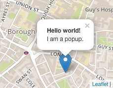
Map Popups are considered a user-friendly and expected feature, and do not share the same negative implications that browser popups do. Map popups are triggered when the user clicks on a feature on something on the map.
A popup can contain any type of content that a web browser can display, including HTML, images, videos and tables. Usually though, less is more — whatever you put in the popup should fit easily on a small smart phone screen. If you have more content then consider using a short description and a link to a separate page with the full content.
Routing

While most users will now use the GPS routing on their phone to get to you, routing is still a nice feature to have on a web map. Routing gives the user an idea of the route that they’re going to navigate and how long it will take before they even get into their car.
Unless your business or event is online only, you should consider adding routing to your map. It’s not a must-have, but it’s something nice that many users will appreciate.
Routing doesn’t just mean car directions either, there are routing options are available for walking, biking and other modes of transportation.
GeoLocation
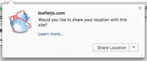
If the features you show on your map initially are far apart (eg. different cities or states) you can use GeoLocation to detect where the user is, and zoom the map to that location.
For exact GeoLocation the user will need to grant your website permission. When permission is granted, the accuracy of GeoLocation results will vary depending on the user’s device. Smartphones equipped with GPS will typically be accurate with 10-15 meters while laptops that must rely on wifi networks might be accurate only within several city blocks. . If a rough location is acceptable you can avoid asking the user for their location and GeoLocate using their IP address.
Displaying Large Quantities of Data
Trying to cram too much data on a map will swiftly make it useless to all but the most patient of users. How much is too much depends on how big your map is and other factors. If you think that it’s a lot, but not too much, it’s probably too much — your users probably aren’t as familiar with the map and data as you are.
So what should you do when you have lots of data to display? You need to start thinking beyond just placing points on a map. Here are three techniques that you can use to make your map easier for users to navigate when confronted with lots of data.
Conditional Visibility Zoom Level Visibility
If some features in your data are more important than others, then you can split them up into multiple layers. The most important features can be displayed when the user is zoomed out (eg. at a national level). As the user zooms in the layers with more details will be displayed as well.
You’ve probably seen this when looking at a map of cities. When you look at the whole country only the largest cities are labeled. As you zoom in to the state level you’ll likely see the state capital and several other large cities. If you continue to zoom in you’ll be able to see even the smallest of towns.
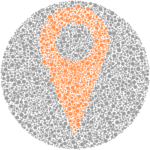
Clustering Points
In cases where data is of the same importance, clustering might be a good choice. Clustering combines close points into a single cluster when zoomed out, but the clusters break apart into individual points as you zoom in.
Clusters are very efficient and work well even on devices with low memory. If you’ve got lots of points, clustering should be considered.
This clustering demo, and the heatmap one below, show the over 30,000 cities and towns from across the United States.
Heatmaps
If the individual points are not important, but their distribution is, a heatmap might be the way to go. With a heatmap, the individual points are not shown at all. Instead, the points are used as the input data to generate a color gradient that shows how which areas of the map have more points than others.
Go Tell Stories
The most interesting maps don’t just show data, they tell a story with it. Wisely use layers, color, size, symbology, and interactivity to tell you story with a map. For certain stories you may need more advanced map tools such as time sliders, map editing or a custom interaction that makes sense to your users.
Although this has been a long read, we’ve barely scratched the surface of what is possible when it comes to presenting your data. If you’d like our help to navigate your map creation process, please feel free to contact us for assistance!

Tim Cimbura – CEO, CFO and Solution Engineer
Tim is an expert in creating custom business solutions that make businesses more effective, productive, and profitable. He specializes in rapid application development with Claris FileMaker, Laravel, and WordPress. He also knows Apple macOS technology inside and out.